Image

CIVORA Dashboards

Visualise and analyse data
See it live here
Image

Civora Dashboards

Visualize and analyze data
Click through CIVORA

Visualising and analysing data

Understanding and purposefully developing cities

The sheer volume of data and information is almost impossible to use meaningfully without digitalisation. Urban dashboards provide an effective way to visualise and analyse data from multiple sources and engage with citizens - enabling targeted urban development.

Together with our Urban Data Platform, dashboards can also be used to establish early warning systems. When critical thresholds are reached - in traffic or energy supply, for example - warnings are sent automatically and countermeasures triggered. This enables targeted management of cities and regions.

Image
Image

The features

As diverse as cities
Image
Image

1. Set up dashboard

Why?

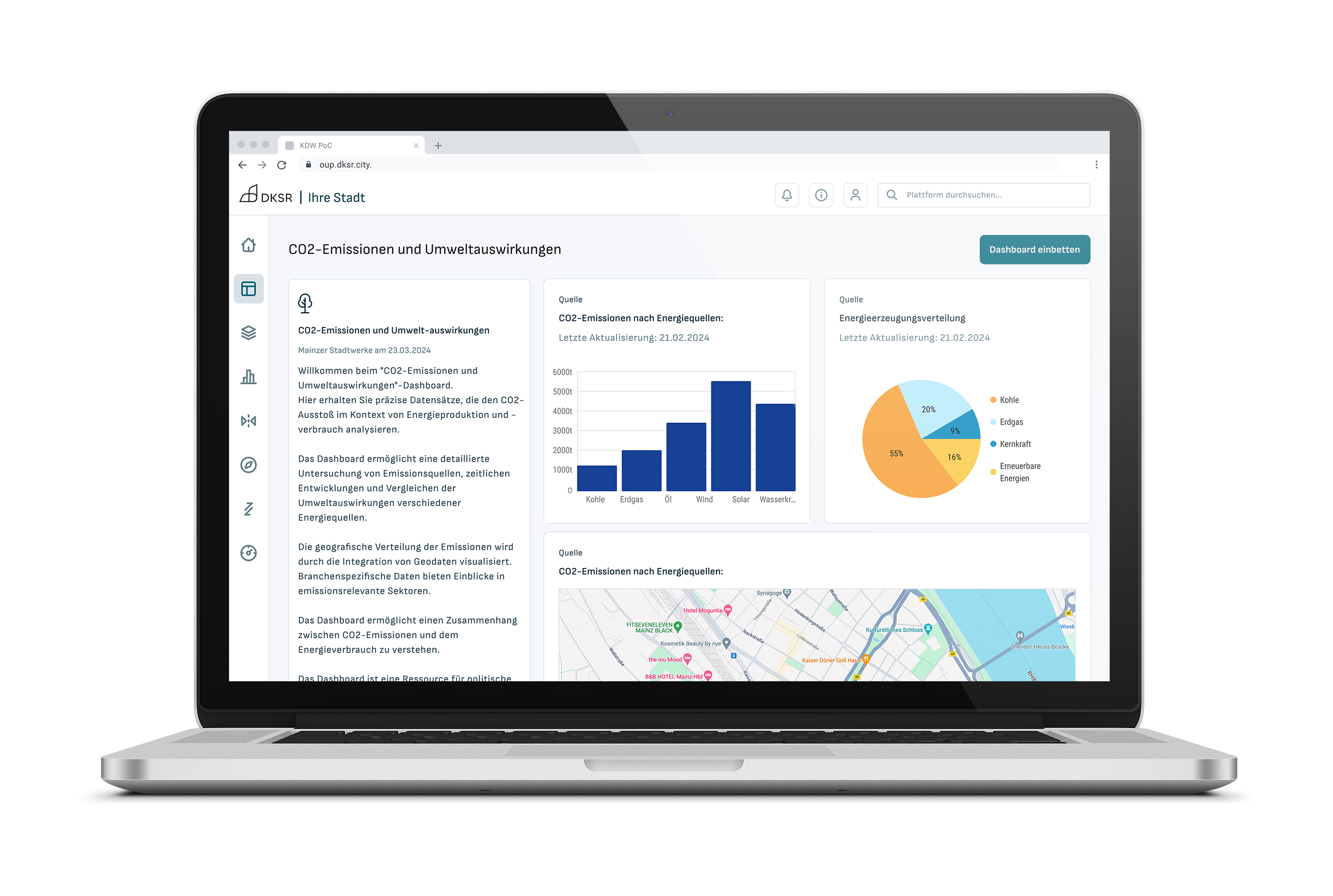
Dashboard goals and use cases are diverse and differ from city to city. That is why you need different data types, analyses and visualisations - and naturally different privacy settings too.

How?

CIVORA lets you configure your dashboard to your exact needs - we take care of the initial setup and train your team. The dashboard works with static, synthetic and real-time data. You choose freely which categories to analyse and visualize. Not sure whether to go with Grafana or Apache Superset? We are happy to advise. You also decide which visualizations are public and which remain internal.

Result?

The CIVORA dashboard helps you understand your city or region better, supports informed decision-making and creates transparency - so you can manage your city effectively and reach your goals.

Try CIVORA for free

2. Analyse and visualise data

Why?

CIVORA dashboards support a wide range of analyses. Whether you're looking at economic growth, social inequality, environmental data or sector-specific topics such as energy, buildings or transport - dashboards reveal trends and developments at a glance.

How?

For visualisations and analyses, you can choose from diagrams, charts and percentage distributions in a variety of designs. Graphics can be complemented with descriptions for different topic areas. You can also display maps to show, for example, the locations of data collection points or new construction projects. Erhebungsquellen oder Neubauprojekte anzuzeigen.

Result?

By analysing and visualising data, you gain a better understanding of your city and can create transparency around urban development measures. This allows you to make more informed decisions - and justify them.

Image
Image
Image
Image

2. Data management

Why?

CIVORA dashboards support a wide range of analyses. Whether you're looking at economic growth, social inequality, environmental data or sector-specific topics such as energy, buildings or transport - dashboards reveal trends and developments at a glance.

How?

For visualisations and analyses, you can choose from diagrams, charts and percentage distributions in a variety of designs. Graphics can be complemented with descriptions for different topic areas. You can also display maps to show, for example, the locations of data collection points or new construction projects. Erhebungsquellen oder Neubauprojekte anzuzeigen.

Result?

By analysing and visualising data, you gain a better understanding of your city and can create transparency around urban development measures. This allows you to make more informed decisions - and justify them.

Try CIVORA for free
Capture data, build dashboards, and publish results - try CIVORA for yourself now. Four weeks free of charge and without obligation – GDPR-compliant, no IT migration needed.
Try CIVORA for free
Image

Stay informed!

Stay up to date on DKSR and urban data with our newsletter.
Sign up!
Image

Contact

info@dksr.city
phone: +49 176 8136 3418

Stay informed!

Stay up to date on DKSR and urban data with our newsletter.
Sign up!